|
|
|
|
|
|
|||
|
|
|||
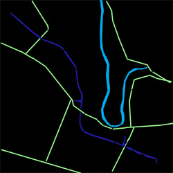
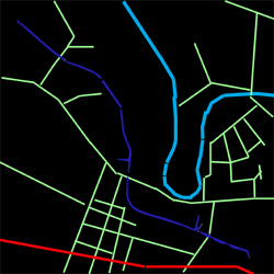
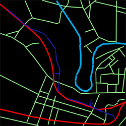
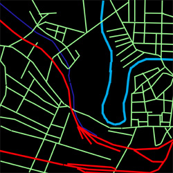
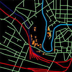
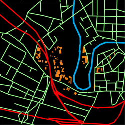
Map Overlay Analysis (right)
The images of the right are the result of a map overlay analysis performed on a series of historic maps from 1820 to the present. The overlays highlight major infrastructure routes and their development over time. In this series, the River Irwell is in light blue, the Bridgewater Canal in dark blue, roads in green, railways in red and the buildings of the University of Salford in orange.
Whilst the unchanging loop of the River Irwell has always defined the geography of the area, the early canal eventually disappears underground, whilst the railways continue to develop until relatively recently. Road patterns which initially grew in an organic fashion underwent a massive period of growth in the second half of the 19th century with streets surrounding mills and houses growing at an unprecedented rate. A period of relative stability followed until the 1960s when the slum clearances began and new housing estates began to reshape the urban fabric.
Logo Map (below)
As an alternative method of visualizing the character of the area, the group has made a 'Logo Map'. The objective of this exercise is to see whether the character of the area can be discerned from visual signage information only. This method effectively highlights the dichotomy witnessed in the area between the highly controlled corporate space of the University Campus with it's highly regulated green markers, and the improvised signs of business owners in the surrounding estates. Between these poles lie various other categories of sign. The signs in the Salford Business Park are similar to those of the University in their careful controlled expression and execution. The housing area of Trinity Riverside which aspires to the City Centre residential market, is clearly expressed by the profusion of 'For Sale' boards from national Estate Agent chains.
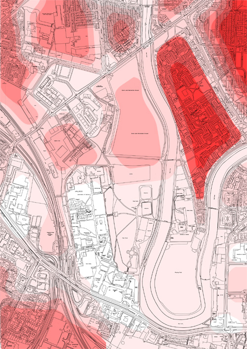
Fear Map (below)
Another alternative mapping method that we have utilized is the mapping of the Fear. The perception of fear is a useful way to gauge people's instinctive, subjective reaction to the urban environment. A huge variety of factors play a part in whether we feel comfortable and safe in any particular setting. Personal preconception and experience can play a large part in this, but there are also many physical markers that we all recognize when faced with unfamiliar terrain. This mapping method is particularly useful in the context of our study area because of the extremes of circumstances that exist in close proximity. The cafefully control and heavily people spaces of the University campus are only a few metres away in places from one of the most notorious estates in the region. Consisting predominantly of 1970s hosing based on an impenetrable Radburn layout, the Broughton estate has many visual hallmarks of deprivation. These visual fear markers are enhance in student mind by the local police and University staff who constantly warn them not to go anywhere near the area.
This is clearly only one of many possible fear maps - each is to some extent personal to it's author. It is possible that a similar map drawn by a resident on the estate will have many of the colours reversed, as the feel comfortable around their own homes, but may not on the University Campus.
White areas on the map indicate where no fear is felt, whilst red indicates severe fear, with the shades in between marking various degrees of fear in between.